For too long, color has been treated as the finishing touch of event design.
A stylistic choice. A visual layer added once the real decisions have already been made.
That approach no longer works.
Because color does far more than make a space look beautiful.
It shapes mood, influences perception, guides attention, and can even encourage people to respond in a certain way.
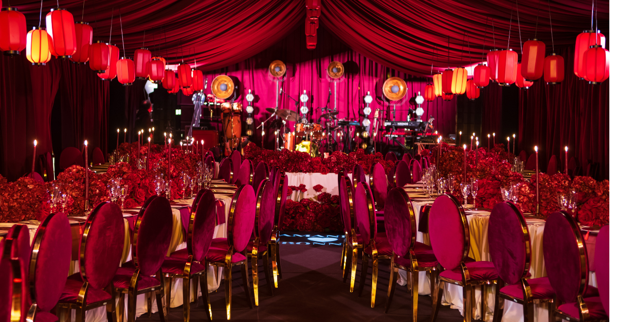
Event designer Brian Green frames color as a tool that can make a space feel intimate or expansive and can change the way an audience experiences the room.
In other words, color is not decoration. It is direction.
The real mistake is starting with palette instead of intention.
The wrong question is still the most common one in event design: What colors should we use?
The right question is: What should this event make people feel?
Green's process starts there.
He asks clients about their favorite colors, the mood and emotions they want to evoke, the goal of the event, the colors they dislike, and even what they would wear on the Academy Awards red carpet.
These are not surface-level questions.
They are a way to uncover the emotional logic of the event before any palette is built.
That shift matters.
Because when color is chosen as an emotional and strategic language, not as a decorative preference, every element becomes more coherent.
Floral design, lighting, tablescapes, printed materials, textures, draping, staging: Everything begins to work as part of the same story.
A palette is not a preference. It is a system.
Color is never just a decorative choice. In event design, it works as a structured system that shapes atmosphere, visual hierarchy, and emotional response.
That is why a strong palette should not be built around personal taste alone, but around the effect the event is meant to create.
This is where basic color theory becomes useful.
Every palette is built through relationships on the color wheel: some colors sit close to one another and create harmony, while others sit opposite each other and generate contrast.
The balance between hue, saturation, tone, and temperature determines whether a space feels calm, dramatic, intimate, energetic, or refined.
A monochromatic palette, built from variations of a single color, usually creates elegance, control, and visual consistency.
Complementary palettes, based on opposing colors, tend to feel bolder, sharper, and more memorable because contrast immediately captures attention.
Analogous schemes, made from neighboring colors on the wheel, create softness and immersion, making them especially effective when the goal is fluidity and atmosphere.
More complex structures, such as triadic or tetradic palettes, can bring richness, depth, and a more layered visual identity, but they require far more precision to avoid confusion or visual overload.
Not every palette serves the same purpose, and that is exactly the point.
Color choices influence how guests read a space, where their attention goes, and how coherent the overall experience feels.
When planners treat color as a matter of taste, they underuse one of the most effective tools available to them.
When they treat it as a system, they gain control over tone, cohesion, and guest experience.
Good color choices do not only reflect a brand. They reflect context.
Color carries psychology, symbolism, and cultural weight, and those meanings are not universal.
That makes color selection especially important for international events and high-context experiences.
A palette can reinforce a message, but it can also distort it if cultural associations are ignored.
In the Crazy Rich Asians premiere party, where green, gold, and pink were chosen not only for visual harmony but also for their symbolic associations with prosperity, wealth, and marriage in Eastern color theory.
This is where event design becomes more than styling.
It becomes interpretation.
In 2026, the trend conversation is quieter and more revealing.
Whenever the industry talks about color trends, the conversation tends to collapse into one headline shade.
But the 2026 market signals something broader and more telling.
Pantone's Color of the Year 2026 is Cloud Dancer, a soft white positioned around calm, clarity, and a sense of reset.
Sherwin-Williams selected Universal Khaki, an essential neutral built around longevity and restraint.
Benjamin Moore chose Silhouette, a deep espresso-brown with charcoal undertones.
Behr, meanwhile, named Hidden Gem, a smoky jade that balances calm with depth.
Taken together, these forecasts point in the same direction even when the shades themselves differ.
The 2026 palette language is moving toward refined neutrals, earthy warmth, deeper browns, mineral greens, and grounding tones that feel versatile rather than loud.
That matters for events.
Because following a trend in 2026 does not mean dropping a fashionable color into a room and calling it relevance.
It means understanding that the market is moving toward palettes that feel more considered, more atmospheric, and more enduring.
The question is no longer whether a color is current enough.
The question is whether it gives the event depth, precision, and emotional coherence.
The smartest events know what guests see first.
Another sharp insight from Green is that effective color strategy is not about obsessing over every surface equally.
Floors are covered. Walls and ceilings can be transformed with drapery and light. What matters most is where the guest's eye goes first.
That is a useful discipline for event design right now.
Because great color strategy is not about filling every inch of a venue with pigment. It is about controlling the emotional and visual priorities of the room.
The point is simple
Color should not be the last design choice made on an event.
It should be one of the first.
Used well, it gives structure to emotion, clarity to concept, and depth to experience.
Used poorly, it reduces event design to styling without meaning.
And in a market where so many events look technically polished but emotionally interchangeable, that difference is everything.
Color does not just fill a room.
It tells people how to feel once they are inside it.