There is a mistake the event industry still makes all the time.
We assume that if a room looks good in person, it will also look good on a screen.
It will not. Not automatically. And definitely not on a smartphone.
That matters because today an event is not only experienced live. It is also experienced through dozens, sometimes hundreds, of phone cameras in real time. Guests do not just attend. They shoot, post, crop, edit, and publish. Which means that the visual quality of an event is no longer judged only by the people in the room, but by the way the room translates into digital images.
And this is exactly where the technical side begins.
Cameras do not see color the way people do
One of the most useful things to remember is also one of the least understood: a digital sensor does not “see” color the way the human eye does.
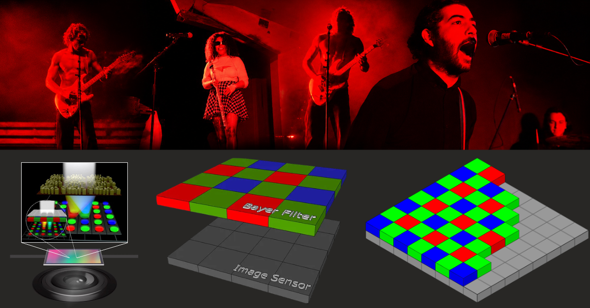
At sensor level, the camera is essentially reading light intensity. To reconstruct color, most digital cameras rely on a Bayer filter, a matrix made of red, green, and blue filters placed over the sensor. This means the sensor is not reading full RGB color at every pixel location: it is reading partial color samples that later have to be reconstructed into a full-color image.
And the sampling is not balanced.
In a Bayer array, green is oversampled at a 2:1 ratio relative to red and blue. That makes sense perceptually, because luminance detail is more closely aligned with green information. But it also means the recorded scene is already biased toward a certain structure of color acquisition before any image is processed.
It means the image your guest captures is already the result of interpretation. The camera is not simply recording color as it is. It is collecting partial color information and then rebuilding a full-color image through a computational process called demosaicing.
So when event professionals talk about “what the room looked like” they should remember something important: the phone is not recording the room directly.
It is reconstructing it.
This is why some colors are harder than others
Red is the perfect example.
Deep, saturated reds often look rich and controlled in person. In photos, they can become fluorescent, flat, clipped, or strangely artificial. And that is not just a styling issue. It is a capture issue.
With a Bayer pattern, only a quarter of the filtered samples are dedicated to red. When a scene contains a dominant, intense red subject, those red-sensitive sites carry most of the burden. If the light is strong or the red is too saturated, those values can hit the upper limit very quickly. At that point, subtle tonal differences start collapsing. The image stops describing the red and starts simplifying it. Edge color can shift. Surfaces can lose separation. Dense details can break into false texture or chromatic artifacts.
That is why red fabrics, red florals, red scenic elements, red carpets, or strong magenta-red lighting often photograph worse than they look live. The camera is not being “bad.” It is running into a very real technical limit in how color is sampled and processed.
The problem gets worse when lighting is designed only for atmosphere
This is where event production often gets it wrong.
Lighting designers are rightly focused on mood, drama, depth, and live impact. But if the setup ignores how phone sensors respond to contrast and color saturation, the result can fall apart the moment someone raises a camera.
An event can feel immersive in person and still produce weak content online. Skin tones shift. Reds clip. LED color washes become muddy. Highlights blow out. Backgrounds disappear. Details that felt refined on site turn into visual noise on a screen.
That is not a contradiction. It is the consequence of designing only for the eye and not for the sensor.
And today that is no longer enough.
Because in practice, every guest is carrying a small computational camera system in their pocket, with automatic exposure, automatic white balance, aggressive compression, and image processing decisions happening in fractions of a second. If the visual environment is unstable, the phone will make compromises. Usually bad ones.
JPEG is often where the event loses control
Another part of the problem is format.
Most guests are not shooting RAW (unprocessed photos). They are shooting JPEG, or whatever compressed image pipeline their phone applies by default. That means the camera is already reducing, simplifying, and compressing the color information before the image ever gets posted.
This matters even more with difficult colors. In a mostly red image, the weak information in blue and green channels contributes less to tonal nuance, and once the image is processed into a limited bit-depth output, much of that subtle variation is gone. What remains is often a harsher, less believable red than the one people actually saw in the room.
So when event teams wonder why a beautiful installation looked expensive in person and cheap on Instagram, the answer is often technical before it is aesthetic.
The color was not translated well.
What you can do as an event professional
There is one, easy and effective fix:
Ask your lighting designer to avoid pure Red, pure Green or pure Blue lights, as they will activate just a fraction of the camera sensors and make the image looks muddy.
We all know there is a tendency of using huge oversaturated “wash” of red light or blue light. Just don’t do it.
Add some White light or just a bit of the other RGB components to your lights (your eyes will not even notice it, but the camera will). Or choose different, mixed colors: oranges, violets, teal, lavender, yellows…
Check the effect using a camera – even a phone works great for that – and adjust accordingly.
If you are very serious about controlling lights (and camera outputs), a more serious version of the conversation starts earlier. That means thinking about spectral quality, color temperature, CRI, exposure balance, surface reflectance, and saturation control. It means understanding that some materials behave beautifully in person and unpredictably on camera. It means knowing that very dense reds, certain violets, glossy finishes, LED-heavy scenes, and mixed light sources can all become problematic fast.
And it means accepting that “Instagrammable” is a shallow word for a real technical challenge.
